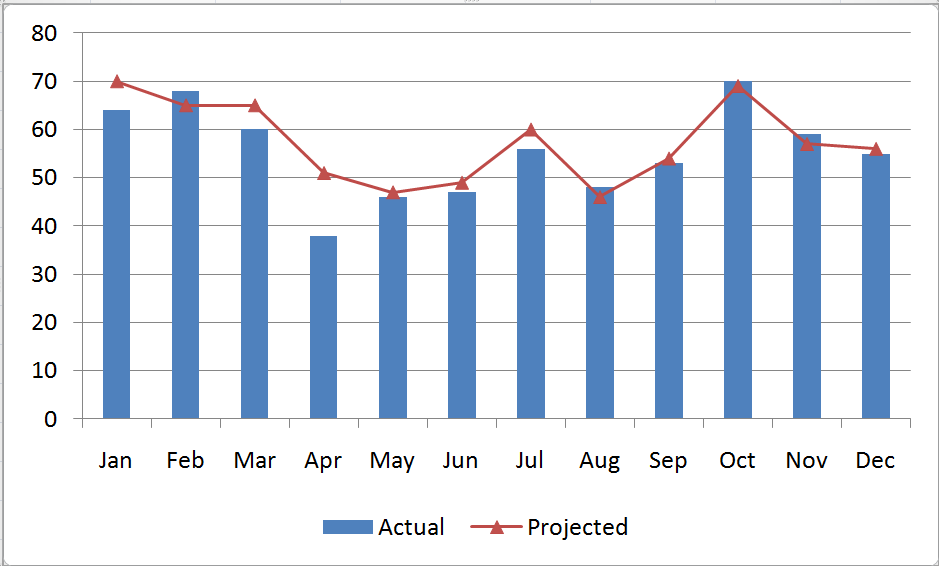
A combination chart is when you combine two different charts to make one. A popular example of combination charts is a line & bar graph combination.
1. Put your data in the spreadsheet. For example, use the following data of Sales and Profits.
2. Make a simple bar chart for the Sales data. Select the Sales data, go to the "Insert" tab, choose "Chart," and specify type as "Column Chart."
3. Select the Profits data, copy the data, select the Sales chart, and paste the data in to the Sales chart. Essentially you are adding one more series of data to the sales chart.
4. Now the chart should look like below. Right click on the new series (profits) and select "chart type."
5. From the chart type dialog change the type of chart to what you desire.
This information is originally taken from: http://chandoo.org/wp/2009/01/05/excel-combination-charts/.
his file, along with illustrations can also be found in SharePoint > Software Users Group > Shared Documents > Excel > Combination Charts.