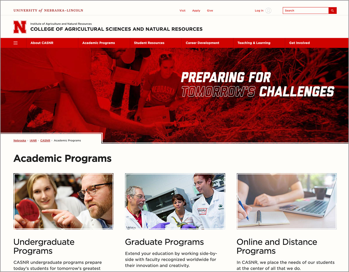
Before Fall 2020 classes began, the College of Agricultural Sciences and Natural Resources teamed up with IANR Media to convert their website menu navigation from audience-based to topic-based. Audience-based menus organize content into sections based on who the audience is, whereas topic-based organizes sections by topic. Although both are common practice, topic-based was recommended by the Web Developer Network after reviewing higher ed websites and user experience research.
"Audience-based menus can be problematic, especially when a user identifies with multiple audiences. It forces a user to first try and figure out which audience they belong to before they can find the content they want. Also, with audience-based menus, it can be unclear if the content is for an audience or about an audience, like in the case of 'faculty and staff'. The user may think they're going to a directory listing but instead, they find resources for teaching and administration. And, since the same content may apply to multiple audiences, it can result in pages having duplicate content or duplicate menu links, both of which should be avoided for usability and search engine optimization reasons," said Anne Holz, web strategist, IANR Media.
Changing menu names from audience to topic-based isn't always a one-to-one relationship. As a result, content may need to be reworked and new pages may need to be created. During the process, CASNR took the opportunity to examine and enhance other areas of their website as well. Over 40 pages were extensively updated, redesigned or created. In CASNR's case, the project coincided with a time when providing abundant online resources and rapid back-to-school updates were more crucial than ever.
The process began with IANR Media recommending a new menu structure based on a review of the website's content. The new and old menus were reflected in a spreadsheet and changes were detailed in a document as to which pages would need to be updated, removed and added. CASNR assigned teams to each section of their website. Team members included faculty and staff involved in leadership, recruitment, career development and student services. Each team met with IANR Media to review the proposed changes and provide feedback before finalizing a new menu.
"Sometimes what sounds great on paper doesn't always translate well to the web. Even though the menu was approved on paper, it needed to be viewed and tested before going live. Once you start clicking around a website, you notice things that weren't apparent before like duplicate content or pages that are hard to find," Holz said.
Working on a copy of CASNR's website gave their team a chance to view, request and approve changes before they went live. It also gave IANR Media a chance to clean up deprecated code, add new "Grit and Glory" brand styles, experiment with automated import feeds and examine ways to optimize top pages for search.
"Once all of the website changes were approved to go live, we had two choices – either manually update the development website to match the live website and then switch the development website live or manually update the live website to match the development website. Neither was ideal. Quite a bit of time had passed since the project began. But, since we had a better idea of what we had changed on the development website than what had been changed on the live website, we chose the second option.
The transition was quick and went really well. Our team kept precise documentation listing which pages to move, rename, delete and add new. We also kept a spreadsheet mapping the old URLs and page titles to the newly optimized URLs and page titles, for future Google Analytics reporting. We had placed descriptive comments in the CSS and noted all configuration and setting changes that needed to be ported over for automated feeds. The inherent collaborative nature of the CASNR dean's office team also contributed greatly to the success and timely rollout," Holz said.
More details at: https://casnr.unl.edu