The Low-Click Learners dashboard in Canvas Course Insights focuses on student engagement drop-offs by tracking their click activity. The data can help instructors address student struggles related to participation, which in turn could help with successful learning outcomes.
What does this dashboard do?
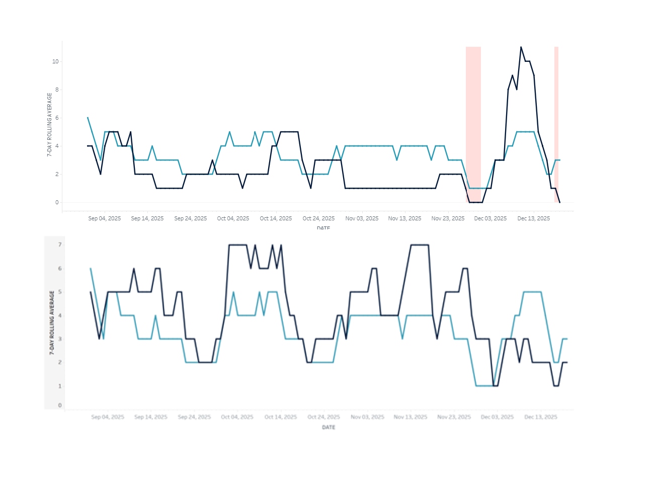
This dashboard averages the number of clicks each student makes in your Canvas course each day and then presents a 7-day rolling average. If you scroll to the list of students, you can click on a student and then get a graph (as depicted in the screenshot accompanying this article) that shows that student compared to the class average. The default view sorts your students alphabetically; you can click on “current score” (total grade for the class) or any of the weeks (column headers) to sort by that information instead.
What to Look for in the Dashboard this Semester
In the image attached to this article, the top graph tells the story of a student who mostly was not clicking into files/assignments/modules in Canvas as much as other students in the class until the last two weeks of the term. When I sorted the class by grade, this student was near the bottom in terms of grades, and in terms of lower-than-average Canvas engagement. Although one week in the graph shows much lower engagement for the whole class, that was over the week of Thanksgiving when I did not give any new assignments, so I wasn’t worried about seeing that dip.
The bottom graph tells the story of a student who clicked in Canvas more than other students; this student was someone who struggled with the class, but also was someone who came to more office hours than other students and who asked lots of questions in class. So, this bottom image is of a student who was very engaged in their learning.
We invite you to look at the Low Click Learners Course Insights for your own classes this semester, and see if you notice any of the following situations:
- Students who started off with click rates close to the class average but then dropped below the class average by the end of February.
- Students who have click rates at or above the class average, but who are not passing the class. This is often easiest to see if you sort the list by “current score.”
- Students who are both doing well in the class and engaging with Canvas materials at or above the class average.
What Actions to Consider Based on the Data
- You might want to communicate to your class that you have looked at the engagement metrics and have noticed that students who are more engaged with Canvas materials are doing better in the course.
- For students not doing well and not engaging in the course, you might refer them to an Academic Navigator.
- For students not doing well but engaged in the course, you might remind them about your office hours and other resources available to support student success.
- For students doing well with high Canvas engagement, you might want to send them a note recognizing that their ongoing efforts to engage in the class are paying off and that you see their engagement directly tied to their success so far. Hollow praise can be de-motivating, but praising specifics (productive course engagement) can be motivating for students to maintain their efforts.
To learn more about how to interpret and act on the data in Course Insights, contact an instructional designer assigned to your college. Individual and collective support (e.g., at a department meeting or course coordination meeting) is available.